BOOK COVER EMULATION STYLE: PART 3. SCIENCE FICTION ASIMOV STYLED BOOK COVER

Welcome to Part 3 of my series on book cover emulation styles. In this article I will tackle the Science Fiction genre. As this is my main writing genre, I may add further articles online in this vein (see www.bookanory.com). In this article, I will examine Isaac Asimov book covers. Asimov was from the golden age of the Science Fiction genre (the 50s to 70s). I read a lot of his books and short stories in my youth. In those days, the art work was derived from the imagination and much less realistic than today’s Science Fiction cover work. Ever since Humans walked on the Moon, everything tends to have gotten more realistic. Of course, this doesn’t mean huge errors of judgement are made. Consider the 2014 TV mini-series: Ascension. A craft that size could never been put into orbit 50 years ago and make a trip to the nearest star (even though it turned out that the craft was a Capricorn 1 type hoax. The less said about this series, the better. So I intend to have a good look at the book covers below and try to see if I can perhaps modernise them. I will come up with a good text layout of Author Name, Branding, Tagline and Book Title. I will ignore the robots, as I will be covering book covers with robots in another set of articles (along with Planets, Moons, Wormholes, Stars, Spacecraft, Space habitats like a Spacewheel (think the 2013 movie Elysium), and finally, astronauts.
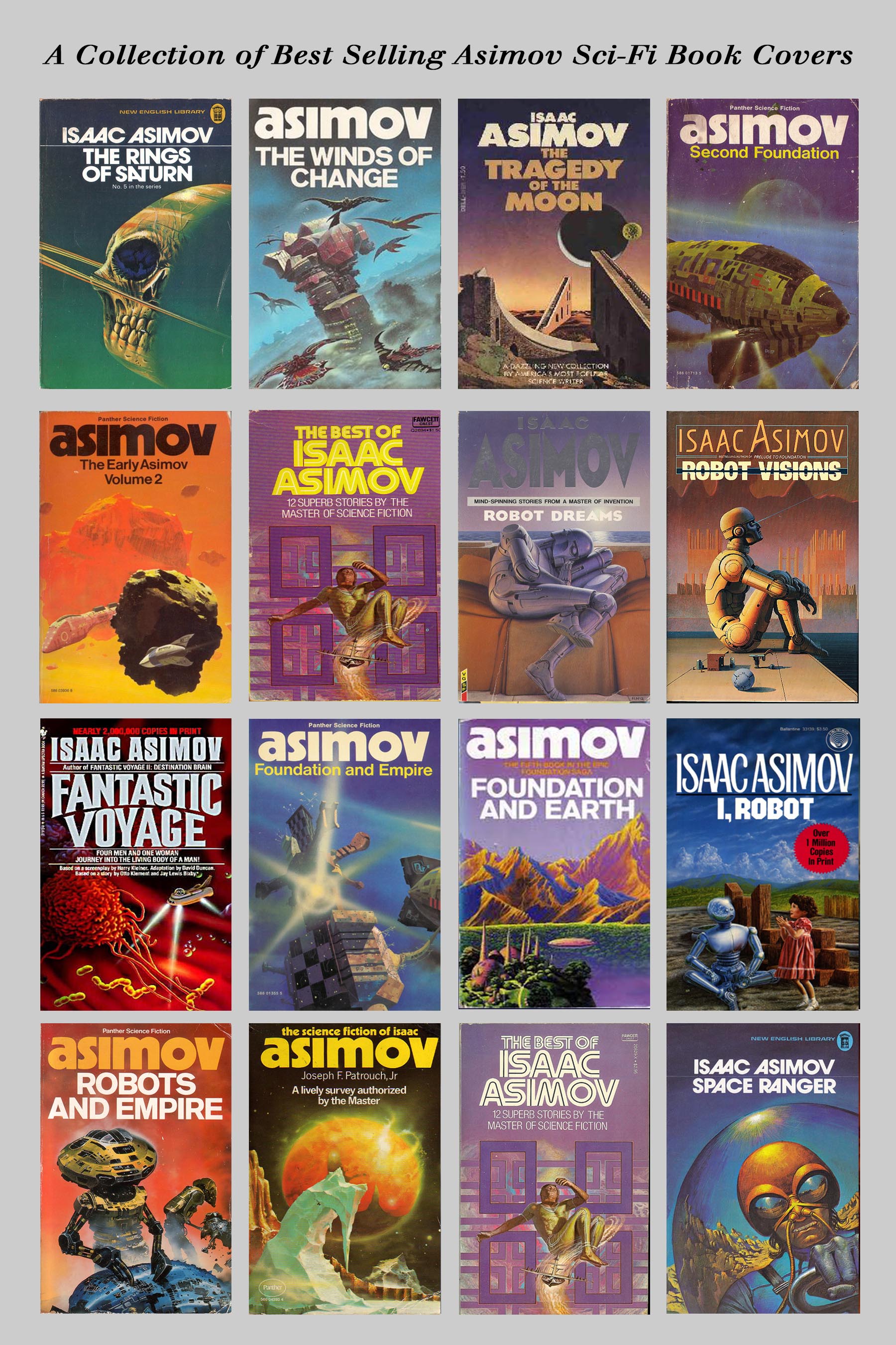
We have to be careful not to copy the imagery of any of the book covers. If our final images are derived from a non-generic image, that would be plagiarising. Hmm… This is trickier than the last two book cover emulations I did (The Alaska Protocol and End Daze). Well, I do have an idea for a novel in the pipeline; namely, The Frozen Planet. I have not done a fiction cover for this book yet. So that is the book cover I will create to the standard of the best Asimov cover. I will consider only the following three book covers as I develop my own.
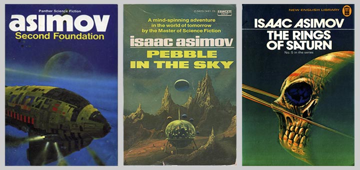
Below is the progression comparison using mainly two of the above Asimov book covers. My finished product is on the right. Notice I used the Book Title presentation font from my previous End Daze book cover cover (which shows the benefits of past experience and a backlog of covers and ideas):
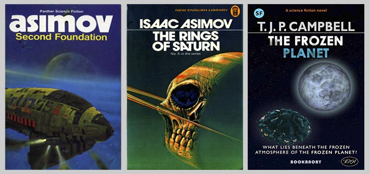
Notice that I simply created a frozen looking planet and an approaching futuristic spacecraft (a bit like the scheme of the book cover on the left above. For the texts, I stuck to my usual Gills Sans for my Author Name and used the End Daze book cover Title font for my The Frozen Planet Book Title. I used the tagline font from The Alaska Protocol for my new tagline shown at the bottom of the page. Finally, notice how the texts of the finished book cover follow the positioning of The Rings of Saturn book cover, in the middle above. I followed the Rule of Thirds to position everything perfectly. Also the colour scheme is just about Orange (from the spacecraft lights) and Teal (from the shading of the spacecraft body. the blue in the Title font on the word “Planet”, the background space and the blue tinge of the frozen planet).
And here is the final cover in more detail:
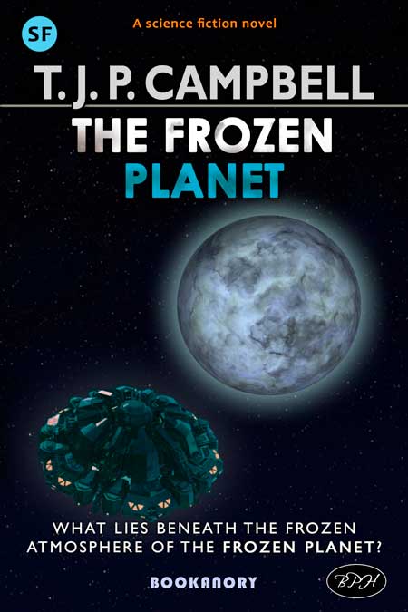
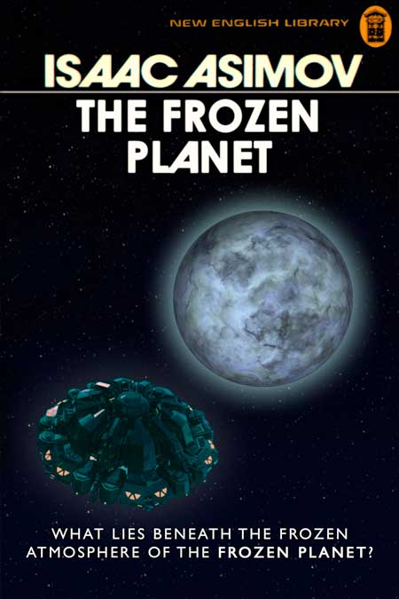
To complete this book cover for publication, I would need to make the tagline a bit smaller and maybe move my spacecraft up a little bit, as I don’t like the spacecraft and the tagline touching each other. And below is what The Frozen Planet would have looked like had I designed the cover for Isaac Asimov and he had written the book instead of me:
Here is a trio of book covers in this style of my book covers:
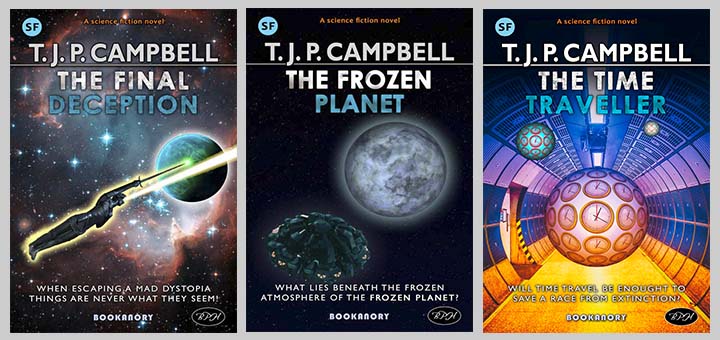
The time to adapt the previously created 2 book covers on the left and right took only ten minutes each. So a lesson to learn is that it is easy to redo previous book covers once you have designed a new template. Once you work to a template your production will speed up.
That’s it for this Asimov emulation style effort. Articles on other emulations of popular and successful book cover styles might follow soon online (www.bookanory.com).


