BOOK COVER TEXTS: PART 3. ORIENTATION AND COMBINATIONS OF TEXTS

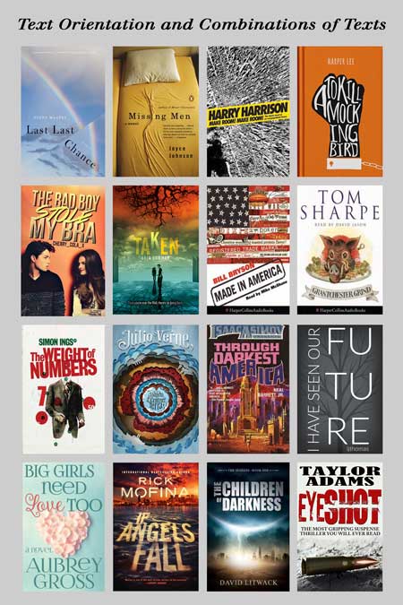
Welcome to Part 3, the final part in this series, of my book cover text series. In this article we will look at Text Orientation and Combinations of Texts on our book cover text. Below gives examples of book covers that show exactly what I mean:

In all the above book covers, either the text is shown in a non-normal horizontal way, or more than one font is used in the title. I think it is fair to point out that this sort of text manipulation is not that common. However, it might just be what your cover requires, so don’t discount using such techniques. I think if you do use such methods, make it subtle, as in the books above Taken and The Children of Darkness. I like The Missing Men cover because it’s quite clever without trying to be clever. A great use of silence being noisy in the visual analogous field.
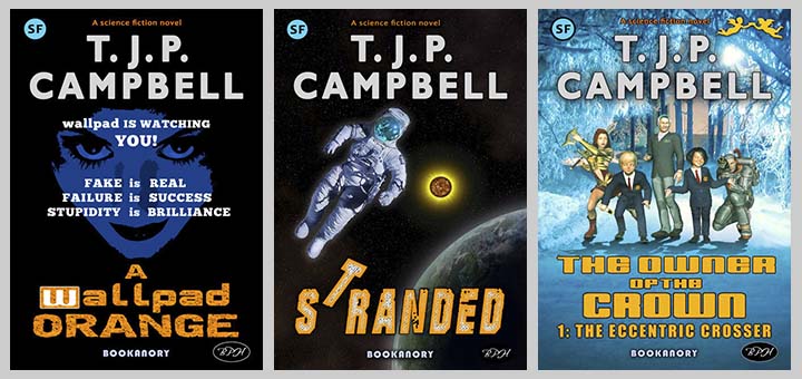
I tend to avoid these techniques because they usually detract from the overall function of a book cover. I only use them subtly. Below are three book covers I have done that show a subtle use of these methods:

In the above three books, I have used a different character for the lowercase letter “w” in A wallpad ORANGE. This letter is an important feature of the dystopian future story. I have moved the letter “T” in Stranded to match the orientation of the ‘stranded’ astronaut. And finally, in the book on the right, I have used two different fonts to help differentiate between the Series Title and the Episode Title.
As these techniques speak for themselves, that’s it for this final part of this series on Book Cover texts.


