BOOK COVER TEXTS: PART 2. MORE ADVANCED TEXT TECHNIQUES

Welcome to Part 2 of my book cover text series. In this article we will look at more advanced techniques to present our book cover text. In my 5 part Book Cover Design series, I mentioned a method I referred to as the Words Incarnate Method. This is where we use the appearance of the text to literally resemble the nature of the book’s content. I gave the following three examples:
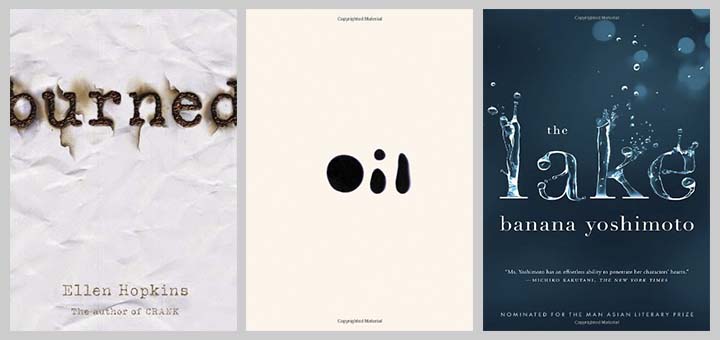
Below I show a collection of Words Incarnate examples:
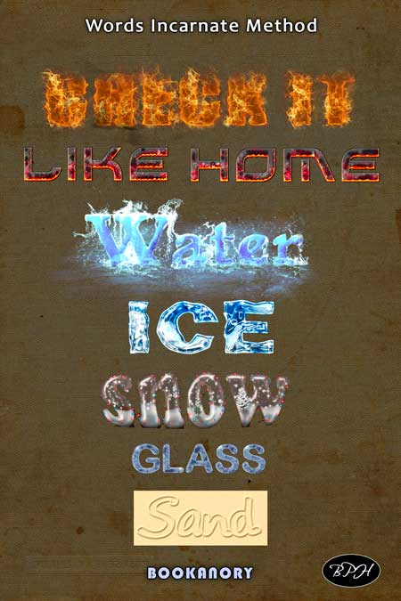
Others you might find are texts on a dripping window pane, chocolate words, liquid words (maybe a cola theme). You need to be careful about using these methods as the words, book and book cover must demand them (as in the book The Lake by Banana Yoshimoto).
Youtube videos you may like to work through that helped me learn to do the above texts are now given:
Fire video by Marty Geller of Blue Lightning TV (Marty may have a voice like William Lane, but he is a youtube hero of photoshop techniques!):
Molten Fire by Pedro Juarez:
Water effect by psdvault.com:
Ice Text by iDesignProduction:
Snow Globe text effect by JazzedTutorials:
Create Glass Text Effect In Photoshop by Mir Rom:
Sand Text Effect in Photoshop by Webflippy Official:
Metal words are also used a lot. See below: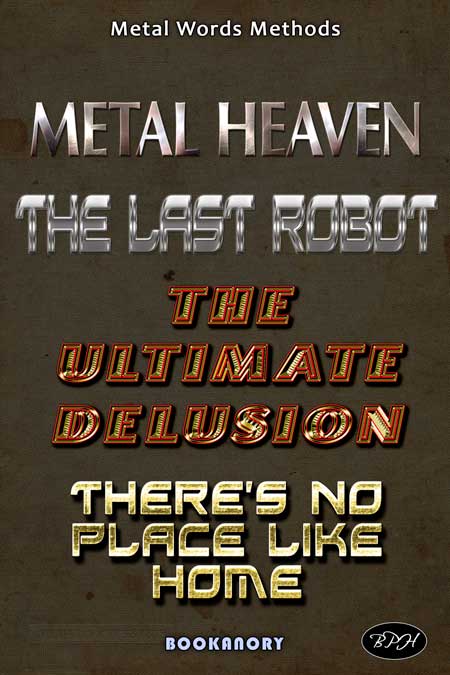
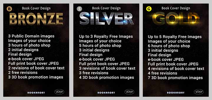
I even used metal words incarnate for my system of book cover services Bronze, Silver and Gold:
You should be able to research these methods using google and youtube. The easy method would be a simple overlay or pattern overlay.
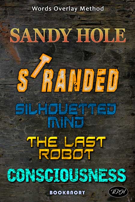
The final examples of advanced text techniques I will show are general overlays. A bit of grunge or any other materials can do wonders for subtly adding emotion or thought to a book cover. You simply place the material over the text words with a clipping mask (or sometimes you can use pattern overlays as in Photoshop and similar programs). See below:
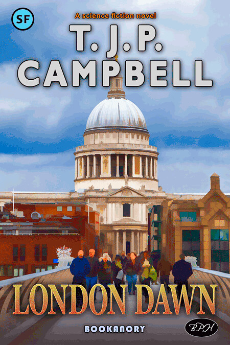
I used the “Sandy Hole” grunge and gradient effort for a colour popping example of an arty book cover. See below:
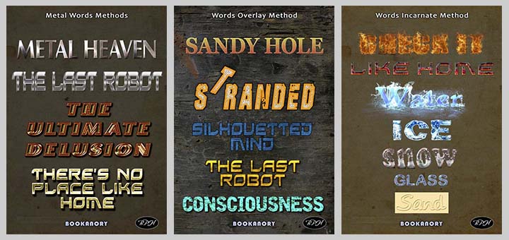
So in summary, we have examined the following examples of text examples for book covers:
You could try to use these effects on 3-D texts, but I avoid using 3-D on book cover texts. They would rarely be seen to complement the imagery of a book cover which would be either flat 2-D imagery (like my example of The Silhouetted Mind) or 3-D, which would clash with the perspective of the 3-D text. Of course, there are no hard and fast rules. Just be sure you know how to break them in your favour. Always be on guard never to overdo your graphics.
Well, that’s it for this Part 2. Next, in Part 3, we examine the orientation and combinations of text employed to form powerful or emotive titles.


